Typography Is Not a Detail: Why Font Choices Matter More Than You Think
The fonts on your website do more than display text. They shape how readers feel about your business before they've processed a single word.
In 2012, filmmaker Errol Morris ran an unusual experiment in the New York Times. He wrote an essay about a question in epistemology (about whether it is possible to truly know something), and he embedded the question directly in the text. Readers were asked whether they agreed or disagreed with a particular statement. What they didn't know was that half of them were reading the essay in Baskerville, a classical serif typeface, and half were reading it in Comic Sans.
The results were striking. Readers who encountered the text in Baskerville were measurably more likely to agree with its claims. The typeface itself, independent of the argument being made, was influencing how seriously people took the content. Morris wrote about the findings in the Times, describing Baskerville as "the king of fonts" for exactly this reason.
Font choices do the same kind of perceptual work on your website.
Type as Tone
Typography is often treated as a finishing touch. Typically, something you choose at the end of the design process when everything else is in place. But this gets the sequence wrong. The fonts you use are not decorating your message. In a very real sense, they are part of your message.
A law firm that uses a playful, rounded sans-serif is sending one kind of signal to prospective clients. A bakery using a stern, corporate typeface is sending another. Neither choice is inherently wrong, but both are choices, and both carry meaning regardless of whether they were made deliberately.
The problem for most small business websites is not that the typography is dramatically wrong. It is that it was never really considered. The default font that came with the website template was kept because changing it seemed like a minor concern. But default choices are still choices, and on a website, they add up.
The Terms Worth Knowing
Typography has its own vocabulary, and a little fluency goes a long way when you're evaluating your website or working with a designer. These are a few of the terms that are worth understanding so you can make an informed decision about what fonts to use.
Typeface vs. font. These are often used interchangeably, but they mean different things. A typeface is the design family (e.g., Helvetica, Georgia, Garamond). A font is a specific instance within that family: Helvetica Bold, Georgia Italic, Garamond 12pt. When most people say "font," they usually mean typeface.
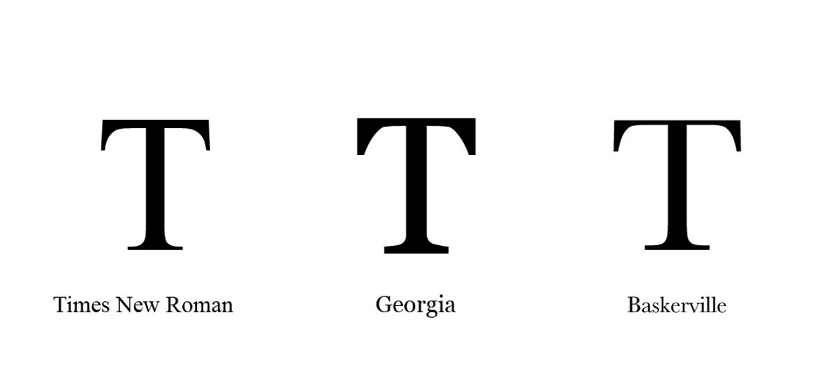
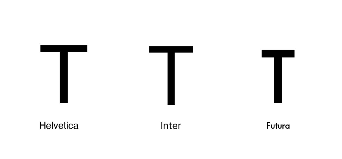
Serif and sans-serif. Serifs are the small finishing strokes at the ends of letterforms -- the little feet on the bottom of a capital T, for example. Serif typefaces (Times New Roman, Georgia, Baskerville) tend to read as traditional, authoritative, or literary. Sans-serif typefaces (Helvetica, Inter, Futura) have no finishing strokes and tend to feel clean, modern, and straightforward. Neither is inherently better for web use, though sans-serif fonts have historically dominated screens because they render more crisply at smaller sizes.
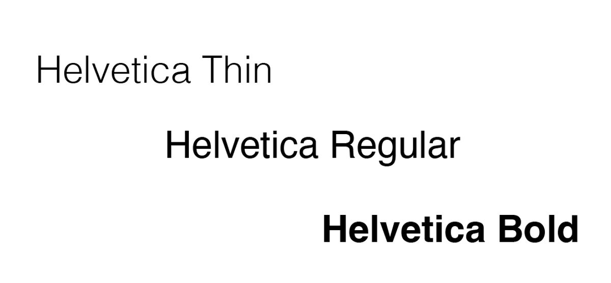
Weight. Weight refers to the thickness of the letterforms -- thin, light, regular, medium, bold, black. Most typefaces offer several weights, and using them intentionally is one of the simplest ways to create visual hierarchy. A bold headline paired with regular-weight body copy gives the eye a clear signal about what to read first.
Size. Measured in pixels on screen, font size affects both readability and hierarchy. Body copy below 16px is difficult to read comfortably on most screens. Headlines are typically set somewhere between 24px and 60px depending on the design, with the goal of creating an obvious visual entry point for each page.
Leading (line height). Leading - pronounced "ledding," named after the strips of lead compositors once used to space lines of type - refers to the vertical distance between lines of text. Too tight and text feels suffocating. Too loose and the lines feel disconnected. For body copy on screen, a line height of roughly 1.5 times the font size tends to read comfortably.
Kerning. Kerning is the adjustment of space between specific pairs of letters. Most digital typefaces handle this automatically, but in headlines and logos, manual kerning can make the difference between type that looks polished and type that looks slightly off without the viewer being able to say why.
Tracking. Where kerning addresses pairs of letters, tracking refers to the overall letter-spacing applied uniformly across a word, sentence, or block of text. Slightly increased tracking can make all-caps text feel more refined. Very tight tracking on body copy tends to make it harder to read.
Hierarchy. In typography, hierarchy describes the visual ordering of information through deliberate differences in size, weight, color, or style. A clear typographic hierarchy - headline, subheading, body copy, caption - guides the reader through a page without requiring them to consciously decide where to look next.
What Good Typography Actually Does
There are a few things that thoughtful typography accomplishes on a website, and they are worth understanding before making any changes.
The first is readability. This sounds obvious, but it is frequently overlooked. A font that is too small, too light, or too decorative for body copy makes reading a physically effortful experience.
On a screen, where readers already tend to scan rather than read closely, anything that creates additional friction is working against you. WebAIM's research on accessible typography recommends a minimum body font size of 16 pixels for comfortable on-screen reading (a threshold many small business websites still fall below). A good body typeface is chosen to disappear, by letting the content come forward without calling attention to itself.
The second is hierarchy. A well-designed typographic system uses size, weight, and spacing to create clear visual levels: the headline, the subheading, the body copy, and the caption. These levels guide a reader through the page and help them understand what matters most. When everything is the same size and weight, the reader has no map.
The third is character. This is the harder thing to quantify, but it is real. The combination of a strong headline font and a clean body font gives a website a personality. It communicates whether the brand is formal or casual, traditional or contemporary, bold or understated. Every business has a character. The typography should reflect it.
Common Mistakes Worth Avoiding
Using too many fonts is one of the most common errors on small business websites. Two fonts - one for headlines, one for body copy - is almost always enough. Three can work. Four or more begins to feel chaotic. Google Fonts, which offers hundreds of free, web-optimized typefaces, is a practical starting point for businesses that want to upgrade their typography without licensing costs.
Ignoring line spacing is another frequent misstep. When lines of text are too close together, the page feels dense and difficult to read. A small increase in line height can make a significant difference in how approachable and readable a page feels. The Nielsen Norman Group has documented how line length and spacing affect reading comprehension on screens, with optimal line length falling between 50 and 75 characters per line.
Choosing a font because it looks interesting rather than because it fits the brand and context is a third common error. Decorative fonts have their place, typically in a logo, a hero headline, or a pull quote, but they are seldom appropriate for paragraphs of body copy.
Starting with What You Have
You do not need to commission a custom typeface or invest in expensive design software to improve your website's typography. Most website platforms give you enough control over font choices, sizes, and spacing to make meaningful improvements.
Start by identifying what fonts are currently on your site. Then ask whether those choices feel intentional. Do they match the tone of your business? Are they easy to read on both desktop and mobile? Is there a clear hierarchy between your headlines and your body copy?
If the answer to any of those questions is uncertain, that is worth a closer look. The fonts on your website are doing work around the clock. It is worth making sure they are working in the right direction.
Typography is one of the first things we look at when auditing a website. Let us know if you'd like us to have a look at your site!
Get a Free Website AuditFollow along on Substack to receive the latest articles in your inbox