What Makes a Good Homepage
Your homepage has about five seconds to earn a visitor's attention. Here's what it needs to do in that window and how most businesses get it wrong.

The homepage of your website has an unusual job. It has to welcome complete strangers, orient them instantly, persuade them to stay, and point them toward something useful - all in just a matter of seconds.
That window to capture attention is less than most people assume. Research from the Nielsen Norman Group puts the average time a user spends deciding whether a page is worth their attention at roughly 10 to 20 seconds. For pages that fail to communicate a clear value quickly, the exit often comes much sooner.
The Question Every Homepage Must Answer
There is one question that every homepage must answer immediately and unambiguously: what does this business do?
This sounds simple, but it’s not. A surprising number of business websites bury this information below a full-screen banner image, inside a paragraph of industry jargon, or across a series of rotating slides that a visitor has no patience to sit through. The business may be excellent. The product may be exactly what the visitor is looking for. But if the answer to "what do you do?" requires effort to find, many visitors will leave before they find it.
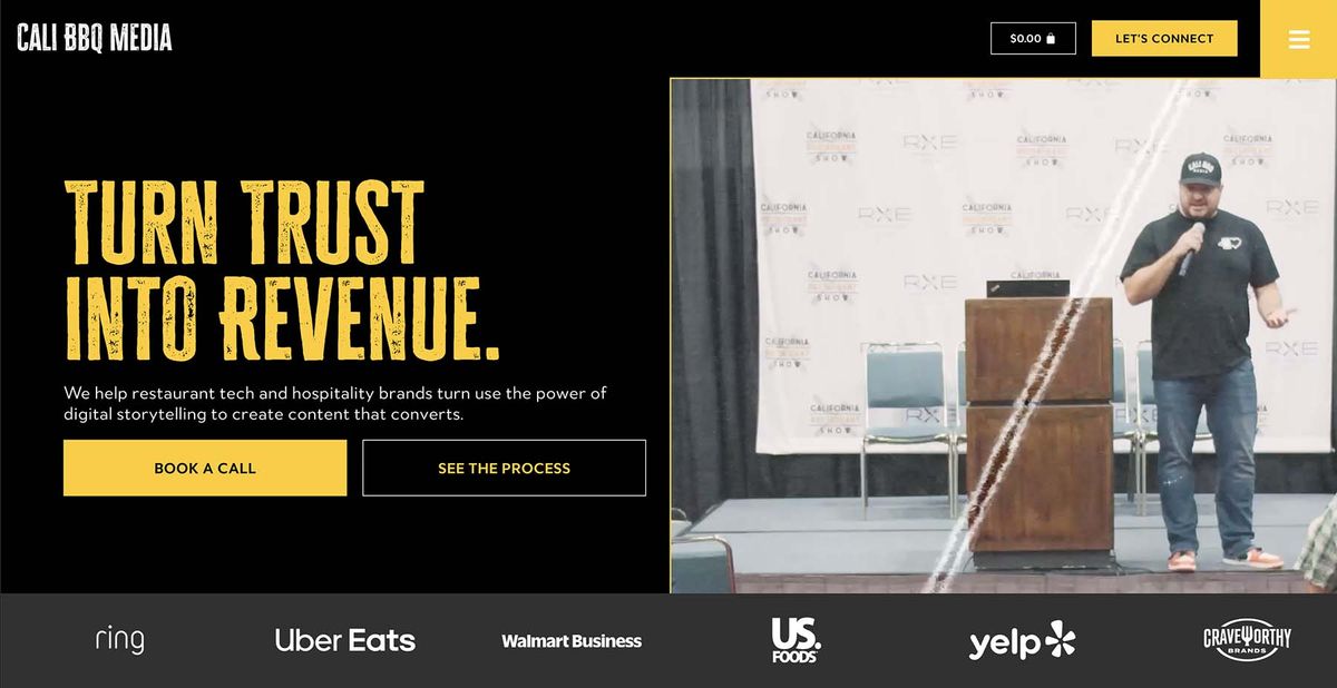
The businesses that get this right tend to have a clear, direct statement near the top of their homepage. Something that communicates the core offering in plain language. Not a tagline. Not a mission statement. A description that a new visitor can understand without any prior context.
The Structure That Works
Once the fundamental question of what you do is answered, a well-constructed homepage moves through a predictable. Predictability in this sense is not a virtue in itself, but it is so because visitors have learned to navigate it.
After the core description, visitors want to understand why they should trust you. This is where social proof enters: client testimonials, case studies, notable brands you've worked with, years in business, or any other signal that you have done this before and done it well. HubSpot's research on conversion rate optimization consistently identifies social proof as one of the highest-impact homepage elements across industries.
From there, visitors who are still engaged want to understand their options. What specific services or products do you offer? This section should be clear and navigable, not exhaustive. The goal is to give people enough information to identify whether what you do is relevant to what they need (not to describe every offering in full detail on the homepage).
Finally, the page should make it obvious what to do next. The call to action on a homepage is perhaps the most underinvested element in small business web design. Visitors who are interested and ready to take a step need a clear invitation. A prominent, accessible prompt is the difference between a homepage that generates leads and one that generates visits.
What Tends to Go Wrong
No Data Hierachy
The most common homepage problem is a failure to see through the lens of data hierarchy. When every section of the page receives equal visual weight, the visitor has no clear signal about where to look or what matters most. The eye needs somewhere to go.
Overwriting/Bloated Copy
Homepage copy tends to expand over time as businesses add new information, refine their messaging, and try to address every possible visitor's question. The result is dense, paragraph-heavy pages that most visitors do not read. Eye-tracking studies from the Nielsen Norman Group show that users typically scan web pages in an F-shaped pattern, concentrating on the top and left of the page and reading less as they move down. Homepage copy should be brief enough to scan and clear enough that scanning is sufficient.
Poor Mobile UX
Google's mobile-first indexing means the mobile version of your site is now the primary version Google evaluates, and more than half of all web traffic arrives on a phone. A homepage that was designed for a desktop screen often looks compressed, broken, or simply difficult to navigate on a phone, which means mobile performance now sits at the center of what good homepage design requires.
The Test Worth Running
There is a quick test that is worth applying to your own homepage. Hand your phone to someone who knows nothing about your business and ask them to spend thirty seconds on your site.
Then ask them two questions:
- What does this business do?
- What would you do next if you were actually interested?
If they can answer both clearly and correctly, your homepage is working. If they struggle with either one, you have found your problem.
Tools You Can Use
There are some great tools out there that you can use to help you understand your website better. We deploy many of these on a regular basis to help us understand where we can improve the performance of our client’s websites as well.
- UserBob - ask real people to test your site for you. Pay only for what you need and get actual video recordings of their journey. Ideal for understanding specific workflows.
- HotJar/Lucky Orange - These two SaaS products are competitors, but both do very similar things. Allowing you to gain insights such as anonymous screen recordings, view heatmaps of user interaction on your page and track funnel-specific analytics. Ideal for understanding UX pain points.
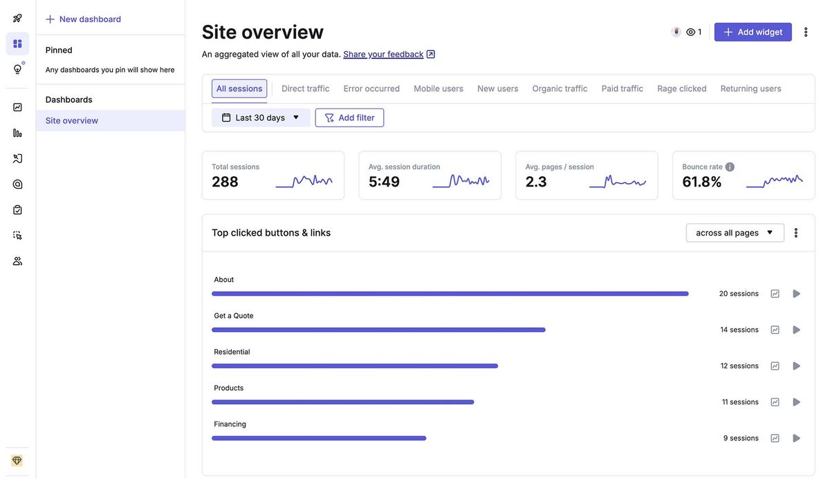
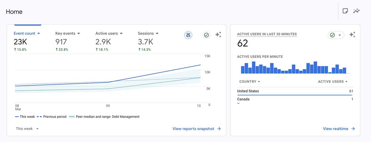
- Google Analytics - Many websites use Google Analytics as their baseline analytics tool. With a bit of customization, you can use GA to track custom events, eCommerce drop-off, form fills, and more. The best part is that it’s free to use. Ideal for custom analytics reports and data aggregation.
A homepage functions as an entry point - the first step in a journey you are guiding your visitor through. The best ones do that job quietly and efficiently, without drawing attention to themselves. Hopefully, with some of these tips and tools, you can take a holistic look at your homepage and find some easy areas of improvement!
If your homepage isn't converting visitors into inquiries, something is off. Mithril Media designs and builds homepages that earn attention and turn it into action.
Get a Free Website AuditFollow along on Substack to receive the latest articles in your inbox