Why Less is More in Web Design (and 5 Easy Ways to Simplify)
The instinct to add more to your website is always right. Learn why restraint is one of the most powerful design decisions you can make.
When people sit down to think about their website, the instinct is almost always additive. Add a section about the company history. Add a rotating banner of testimonials. Add a popup that offers a discount. Add a second navigation menu for mobile. Add a chatbot. Add a video background. Add, add, add.
This impulse is understandable. You want to communicate everything about your business. You want visitors to know all the things you offer, all the reasons to choose you, all the ways you are different from your competitors. The problem is that the attempt to say everything usually results in saying nothing clearly.
The Attention Economy on a Web Page
Every element you add to a web page is making a demand on your visitor's attention. A headline competes with a banner image. A promotional offer competes with your main navigation. A testimonial carousel competes with your service description. None of these elements becomes more effective by sharing the screen with more things. Most of them become less effective.
This dynamic has a name in psychology: Hick's Law, which describes how the time it takes to make a decision increases with the number of choices available. The Nielsen Norman Group, which has spent decades studying how people interact with digital interfaces, applies this principle directly to web design: more options slow users down and increase the likelihood they'll disengage entirely rather than commit to any path.
The experience of a cluttered website is not unlike walking into a store where every surface is covered with merchandise and every aisle is blocked with signage. You don't know where to look, so you don't look anywhere for long.
Restraint, done well, is a form of respect for your visitor's time and attention and a quiet signal of confidence in what you're offering.
What Simple Actually Means
There is a common misconception that simple websites are sparse or cold -- that choosing simplicity means sacrificing warmth or personality. Web design simplicity is about something else entirely.
A simple website makes clear, deliberate choices about what matters most and gives those things room to breathe. It answers the most important questions a visitor will have - who are you, what do you do, why should I care, and what do I do next - without making them wade through layers of additional content to get there.
The best simple websites feel effortless to use. You know where to go. You understand the business within moments of landing on the page. The experience is clean, not because the business has nothing to say, but because the business has been thoughtful about how to say it.
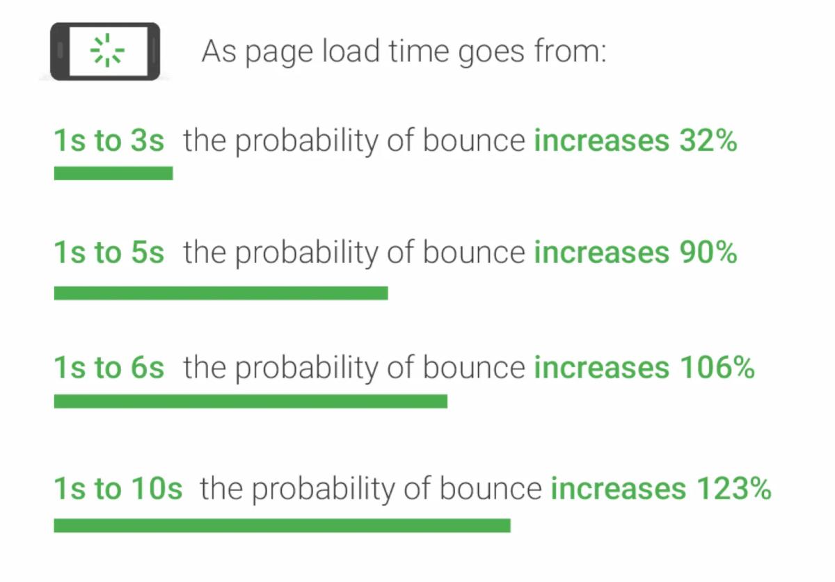
Google's own research on mobile page experience reinforces this point from a performance angle: pages that load faster and present less visual complexity have meaningfully lower bounce rates. The data is consistent across industries.
Simple Made Beautiful
One of our favorite types of clients to work with is restaurants. A typical list of desired outcomes we will receive from a restaurant looking for a new website would look something like this:
- Increase the volume of online orders
- Increase foot traffic in our retaurant(s)
- Increase online reservations to our restaurant
On the other side of that wishlist is the customer. And what is the first thing every customer searches when looking up a restaurant? Their menu. We’ve talked plenty in the past about the importance of making your menu stand out on your website (no PDF!). So knowing that our end-user wants to look at a menu and our restaurant owner wants to increase sales, how do we align these two things to make it happen?
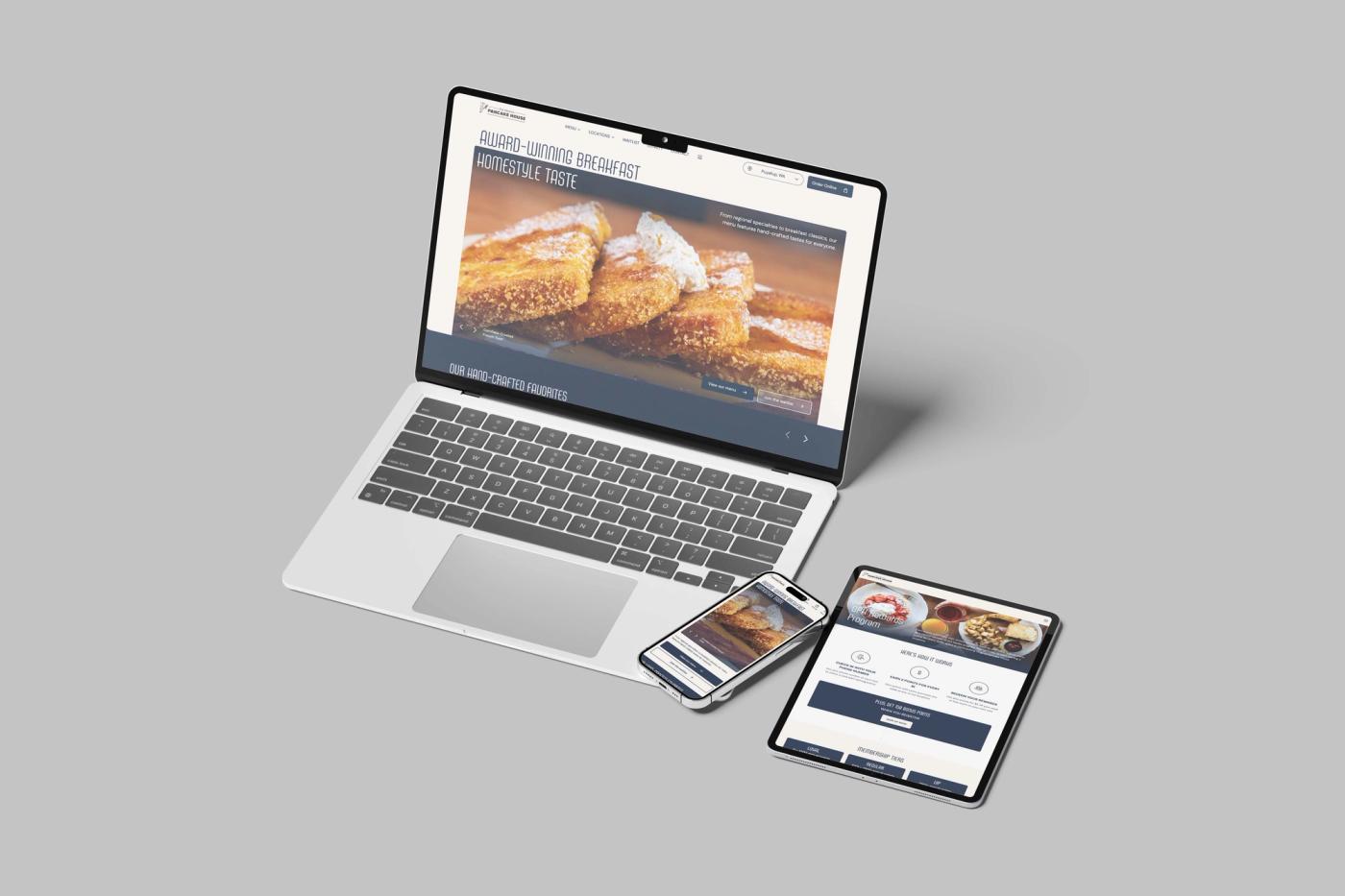
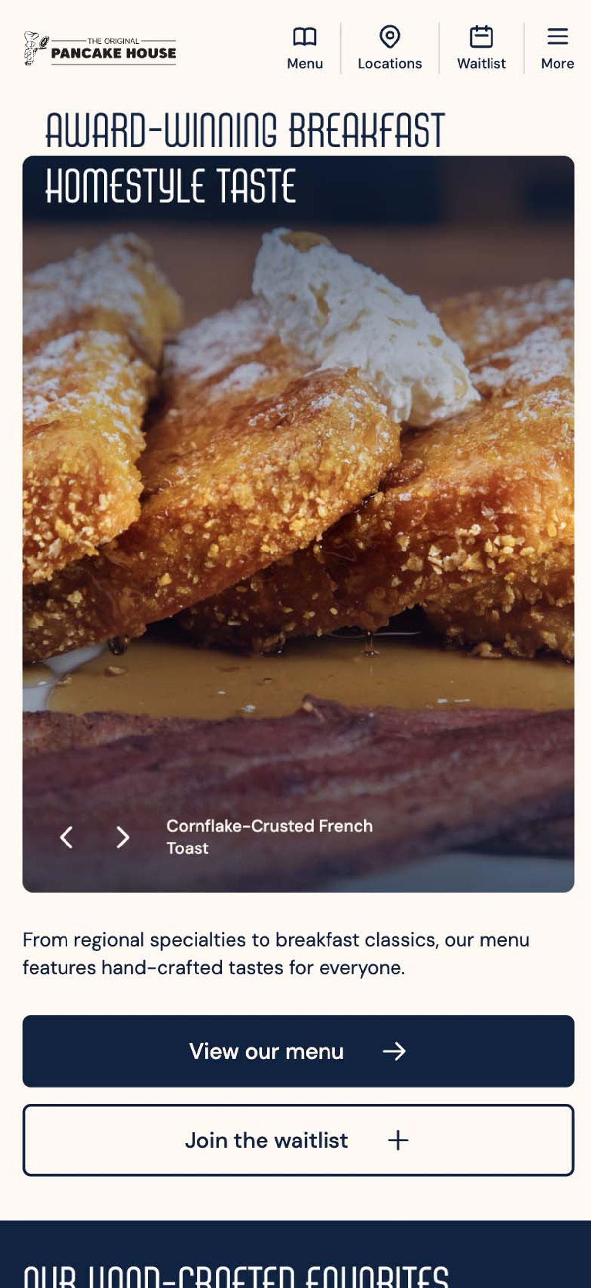
First up, make the menu a primary call to action and focal point. Here is an example of a homepage we designed for The Original Pancake House. We start by making the menu always available with a single click by giving it a dedicated spot in the primary navigation on both desktop and mobile. We then anchor the homepage by using some of their most popular menu items as the primary images and adding a second "view menu” CTA.
This is an intentional design choice. We maintain simplicity without sacrificing beauty. We keep the direction simple and aligned to the end-user’s goal. The result is an average of nearly 2 menu item clicks for every active user on the website, meaning the user is not only able to find the information they want, but they are able to seamlessly navigate to look at different items.
The Hardest Part
The challenge with simplicity is that it requires decision-making. It requires you to prioritize. When you add things to a website, you are deferring the question of what actually matters. When you commit to a simple design, you are forced to answer it.
That process is often uncomfortable. It means accepting that some content will not make the cut, that some messages will not appear on the homepage, that some features will not get built. But this discomfort is productive. The act of deciding what your website must communicate forces a clarity about your business that is valuable far beyond your web presence.
Businesses that have done this work almost always have simpler, more effective websites. Businesses that haven't done it tend to have websites that try to cover everything and end up communicating very little.
Practical Starting Points
If your current website feels cluttered or overwhelming, you do not necessarily need a complete redesign to improve it. There are a few questions worth asking.
What is the single most important action you want a visitor to take on this page? Everything else on the page should support that action, not compete with it.
How much of the content on your current site has been read by anyone in the last year? Most businesses are surprised to find that a significant portion of their web content receives almost no traffic. SEMrush's research on content performance consistently shows that the top 20 percent of pages on most websites drive the overwhelming majority of engagement. Removing or consolidating the rest simplifies the experience for everyone.
Can someone who knows nothing about your business understand what you do within the first ten seconds of visiting your homepage? If not, that is the problem to solve first.
Simplicity, in web design, comes down to a practical commitment to clarity. And on the web, clarity is almost always good for business.
5 Easy Things You Can Do to Simplify Your Website Today
Again, you don't need a full redesign to start moving in the right direction. These five changes are low-effort, high-impact, and something most business owners can act on without a developer.
1. Pick one primary call to action per page. If your homepage has a "Contact Us" button, a "Book a Free Call" pop-up, a newsletter signup, and a chat widget all competing for attention, visitors feel the friction even if they can't name it. Choose the action that matters most and let everything else step back.
2. Cut your main navigation to five items or fewer. Navigation menus grow over time by accumulation. Every new page gets a link, every service gets its own tab, and eventually the menu becomes a directory. Research from the Nielsen Norman Group shows that navigation complexity is one of the leading causes of user abandonment. Each click on a website that feels like the user is closer to their desired goal means you are one step closer to yours. Fewer, clearer options get more clicks.
3. Avoid burying vital information in sliders/carousels. They are among the most studied underperformers in web design. Users rarely interact with slides beyond the first, and they add visual noise and page weight without a meaningful return. A single strong image with a clear headline almost always outperforms a carousel.
Reserve the use of sliders and carousels for secondary information and trust signals that can act as a complement to your primary user journey.
4. Consider deleting or consolidating pages with no traffic. Pull up Google Analytics or Google Search Console and look at which pages have had fewer than ten visits in the past six months. Most businesses find a surprising number. Removing them simplifies your site structure, makes navigation easier, and can improve how search engines crawl and index what remains.
If you have pages that aren’t getting as much traffic as you’d like, this is a good signal that your website is too complicated or not structured well enough for users to find them.
5. Reduce your font count to two. One for headlines, one for body copy. If your site is currently using three, four, or five different typefaces, consolidating to two will immediately make the page feel more cohesive and intentional. It takes about ten minutes and costs nothing. As a bonus, fewer fonts mean faster load times, which should always be a priority for any website.
Thinking about simplifying your website?
Book a MeetingFollow along on Substack to receive the latest articles in your inbox